Main Task

Main Task

Ancillary Tasks

Ancillary Tasks
ancillary tasks

Friday 25 February 2011

Evaluation Question 4

How did you use media technologies in the construction and research, planning and evaluation stages?

Throughout the course, I have used many different media technologies and without them I wouldn't have been able to create a music video like I have now. I'm not going to say it was easy because it really wasn't! Having only used Final Cut Express once before last year to practise editing, I really hadn't got the hang of using the program at the beginning of the course and had no idea where to start editing really. Using a trial and error process and endless google searches I managed to edit the video in the way I had hoped. This program gave us the chance to really do what we wanted with our video as we discovered you really can do almost anything using Final Cut Express, even if it does end up taking you one whole hour to figure out why a cross dissolve is not working in the way it should!


I have thoroughly enjoyed using Blogger and do not think there could be a better way to present my work than this. Blogger has given me the opportunity to present my work in the way that I wanted to and rather than just endless amounts of writing. I think this year I have been much more creative with my blog than I was last year at AS level, as I have used many more tools such as scroll boxes, slideshows and videos which I think has really made the presentation of my work much more interesting to look at and also more enjoyable for me to do. Without the internet I do not really think the creation of our music video would have been possible. Using YouTube and other websites along the way I was able to carry out thorough research for existing music videos and to learn the codes and conventions of music videos of the same genre as our video. This then allowed me to compare our video with other videos and make sure that we had got these conventions right.

We used Final Cut to create and edit the video and also to add all the effects which feature in the video. I did not realise how many effects this programme had...I think it can literally do everything. The effects and transitions that we have included in the main task are:
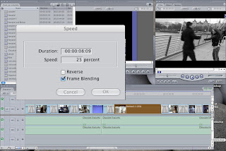


This screen grab shows how we slowed down the shot to create the slow motion effect.It was important that we did this to make this shot look like a memory. This was also done by editing the colour of the shot using the brightness and contrast tools. We thought that it would be effective to have all of the 'memory' shots in black and white so that they stand out from the rest of the video and therefore make it clear to the audience that it is not happening at that present time.


The major effect that we spent a lot of time creating for the music video is the split screen. I think this is also one of the parts of the video that I am most proud of. We had to research how to create this effect because it was not straight forward in Final Cut and there wasn't just a tool to do this for us like most of the other effects which we used. The video which we used to learn how to do the split screen is below:


The video was very helpful and taught us how to create the split screen; however it did go into a lot of detail which made it confusing. In the end, we used the basic instructions which the video had given us and created the split screen ourselves. It was actually much simpler than the video had made out!

To create the split screen I had to put the two shots on top of each other. Then I had to change the size and position of the shot so that they could be positioned next to each other to create the split screen.
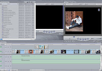
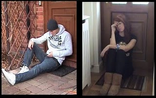

We also used Photoshop in the creation of the video. This was because we had to slow a shot right down to get a close-up of Annabel at one point. The problem here was that there was a woman in the background of the shot so obviously when we slowed it down, she was walking really slowly in the background. We had to make this shot a still shot and edit the image in Photoshop by using the Clone Tool to erase her from the shot:


The transitions that we used within the music video include mainly cross-dissolves but also fades. Cross-dissolves were used in between most shots of the video to ensure that the editing was smooth; if we had just used normal cuts then the editing would have been to fast paced for the music and would just not look right.
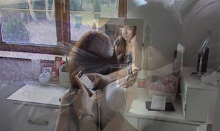
Fades were used to show a change in time and also a change of location. We also used a fade for park scene to show where Annabel disappears and Rich is left alone.


Evaluation Question 3

What have you learned from your audience feedback?

Feedback was a very important and useful part of this process. It meant that we were able to see which parts of the video our target audience liked and which they thought could be improved. For the rough cut, we were given written feedback which was extremely helpful in creating the final cut of our music video.


Rough Cut

The overall feedback from the rough cut was:
  • We had to slow the opening of the video down because it started too sudden and did not really fit the pace of the music very well.
  • There is too many shots of the back of people's heads and therefore more close-ups are needed.
  • The split screen worked well and made the video look of a professional quality.
  • The memories are portrayed well by the change of speed of the specific shots and the desaturation of the memory shots.
From comparing the rough cut with the final cut, I think we have edited our video in accordance with the feedback well and we have done what we could to improve our video to fit the target audience's suggestions.

Final Cut
For the final cut, we decided to use a different technique to gain feedback, so we interviewed some people who would be part of our target audience. We thought that this would be the most useful way to really get peoples' opinions on the video. The feedback is shown below:


Evaluation Question 2

How effective is the combination of your main product and ancillary texts?

From the beginning of the course, I understood that it was important not only to produce the main music video and the ancillary tasks consisting of the magazine advertisement and digipak, but to produce a brand from these three products. The main way we thought of doing this was to use the same character(s) consistently on all of the products. The main character within the video and therefore on the advertisement and the digipak is Rich; therefore he has become the main focus across all three platforms and from my research, it is important to highlight the character's iconography . This is noticed as a music video convention, therefore it is important that we successfully do this to create a product that is similar to existing media products.


By creating a brand we are promoting the product and encouraging people to buy the product. The creation of the brand also means that the products become more recognisable and the target audience will recognise the product without even reading the text or watching the whole video.


We researched existing magazine advertisements and Digipaks to identify the typical conventions and also to give us inspiration for our own products. The main product from the research that stood out most and the look which we decided that we would like to portray in out own products was the magazine advertisement for Plan B's album. However, once I started to create the product in relation to the Plan B products, I realised that it was not really working successfully due to the difference in images and also the mise-en-scene in our own product such as the clothing of the main characters; this did not really work with a black background and spotlight.


After trying different effects and tools on Photoshop, I decided to use the 'difference clouds' effect which create the effect on the background of the advertisement and the digipak. I think that this effect works well as it is eye-catching and due to the fact that I have used it for both ancillary tasks, I think it successfully creates the brand and makes the products successfully recognisable as a complete brand by creating a 'house style'.


I also think that the difference clouds effect reflects the mood of the main characters and sort of uses 'pathetic fallacy' in a way because it is as if the weather (the clouds effect) is showing the characters mood and feelings and also shows the kind of tone of the music video.


I think the images which we used for the ancillary tasks fit the tone and mood of the music video quite well as it is clear that he is in the wrong. This is shown on the front cover if the digipak and also the magazine advertisement. The way that Annabel is 'looking over' Rich shows this and I also think that Rich's facial expression shows his mood and he looks regretful in the same way that he does at the end of the music video.


Evaluation Question 1

In what ways does your media product use, develop or challenge forms and conventions of real media products?

Before starting to create the actual music video I carried out a lot of research to ensure that I had a good idea of the codes and conventions of real media products to the one which I have created. Considering the fact that I have always had a keen interest in music and have grown up listening to many genres of music, I considered myself to have a pretty good idea of the kind of product that I should be creating. I thought that I knew what my music video should look like and how it should be shown; however, after analysing existing music videos I realised that I did not know or understand half as much as I originally thought. People my age tend to see music videos nearly every day but we never stop and think why they have been filmed in certain ways, what camera angles are being used to show what and what is the effect of the mise-en-scene which has been used.

We had to thoroughly research the music video conventions to ensure that we got it right and so that our end product looks like it really could exist in the real music industry. Through the research, I came across a few theories which helped me to understand these conventions more clearly, making it easier to relate the conventions to our own video:

Andrew Goodwin
- There is a relationship between the lyrics and the visuals, with the visuals illustrating, amplifying or contradicting the lyrics.
- There is a relationship between the music and the visuals, with the visuals illustrating, amplifying or contradicting the music.
- Genres are complex and diverse in terms of music video style and iconography
- Record companies will demand a lot of close-ups of the main artist or vocalist
- Voyeurism is present in many music videos, especially in the treatment of females, but also in terms of systems of looking. Some examples are screens within screens, cameras, mirrors, etc.
- there are likely to be intertextual references, either to other music videos or to films and TV texts, these provide further gratification and pleasure for the viewers/fans.

Overall, we knew that one of the main conventions of a music video for our genre would be that the lyrics should relate to the visuals. We have done this on many occasions throughout the music video; there are some examples below:

"just because i'm sorry, doesn't mean i didn't enjoy it at the time.."
-Annabel gets Rich's text through on her phone
We made sure that the word on the screen correlate to the lyrics being sung in the music.


"you're the only thing that i love.."
-Memory of a time when Rich and Annabel were happy together

We desaturated this shot to show that it is a memory and also used a shot where the two of them are laughing and look happy in comparison to the other parts of the video which show how they are feeling in present time.


"a simple mistake starts the hardest time.."
-Rich sees Annabel with another person
We used an over the shoulder shot to show Rich's reaction to him seeing Annabel with another person. We also made sure that he was in the middle of the shot to make it look like he is alone.


The split screen was probably the most important part of the video for us, as it is the part which we took most time on and which we are most proud of.
Here is an example of how split screens have been used in a music video of a similar genre to ours:

Final Cut

Wednesday 9 February 2011

Making the Final Cut

Now that we have been given feedback on the rough cut of our video we can start the challenge of improving and perfecting it to produce the final cut.

From looking at the comments that we were given about our rough cut, we can improve the video to fit the audience feedback. This includes things such as: adding a fade at the beginning, making sure the cuts are smooth and there are no rough transitions etc.

After editing the parts of the video which were commented on in the feedback, we watched the video and picked out all of the parts which we thought could be improved to make the video perfect. We realised that a lot of the shots were very long and they need to be shortened quite a lot. This was mainly a problem in the part were both characters are walking along the embankment.

Another main problem that we had was that the cross-dissolves moved and zoomed in and out slightly once we had rendered the video. No-one had a clue how to solve this problem so I looked the problem up on Google and found a website that said to 'de-interlace' the shots. I did this and the cross-dissolves worked fine!