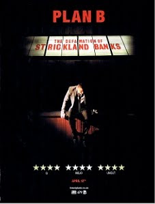
I think that this sort of theme would work quite well as it would portray the feelings and emotions of the characters in the video and the theme of the song aswell.
We also thought that the image on this cover worked well so we have decided that we are going to take a picture of Rich (the main character) standing under a street light and then use an 'overlay' effect which will be a picture of Annabel.
This will hopefully convey the story of Rich cheating on Annabel and she would be 'looking over' him.
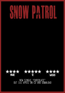
We started to create the basic layout of the advertisement and then will add the photo in later. This is the first draft of the magazine advertisement.
Although we thought that the text looked quite effective, we decided that we would need something a bit more subtle because we want the image to be the main focus of the advertisement where as this text stands out too much on the page and takes up too much space.
Also, having the text at the top of the page also risks it becoming more of a main focus than the image.
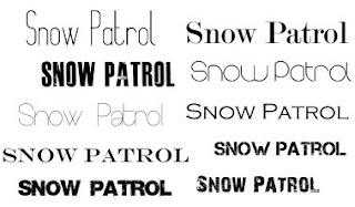
We did some research looking at possible fonts which would be appropriate to use for the text on the magazine advertisement.

After fiddling around with a few fonts and seeing which ones looked best we decided to stick with the font 'round'. We think that this font will make the advert look quite professional and also suits the genre of the song pretty well.

Once we found a font which we thought would look effective on the advertisement, we were able to start adding text to the advertisement.


No comments:
Post a Comment