Friday, 25 February 2011
Evaluation Question 4
Evaluation Question 3
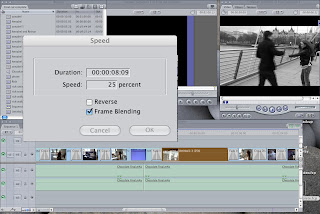
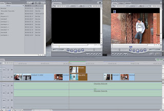
- We had to slow the opening of the video down because it started too sudden and did not really fit the pace of the music very well.
- There is too many shots of the back of people's heads and therefore more close-ups are needed.
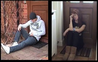
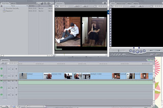
- The split screen worked well and made the video look of a professional quality.
- The memories are portrayed well by the change of speed of the specific shots and the desaturation of the memory shots.
Evaluation Question 2
By creating a brand we are promoting the product and encouraging people to buy the product. The creation of the brand also means that the products become more recognisable and the target audience will recognise the product without even reading the text or watching the whole video.
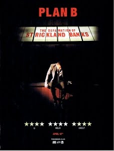
We researched existing magazine advertisements and Digipaks to identify the typical conventions and also to give us inspiration for our own products. The main product from the research that stood out most and the look which we decided that we would like to portray in out own products was the magazine advertisement for Plan B's album. However, once I started to create the product in relation to the Plan B products, I realised that it was not really working successfully due to the difference in images and also the mise-en-scene in our own product such as the clothing of the main characters; this did not really work with a black background and spotlight.
After trying different effects and tools on Photoshop, I decided to use the 'difference clouds' effect which create the effect on the background of the advertisement and the digipak. I think that this effect works well as it is eye-catching and due to the fact that I have used it for both ancillary tasks, I think it successfully creates the brand and makes the products successfully recognisable as a complete brand by creating a 'house style'.
I also think that the difference clouds effect reflects the mood of the main characters and sort of uses 'pathetic fallacy' in a way because it is as if the weather (the clouds effect) is showing the characters mood and feelings and also shows the kind of tone of the music video.
I think the images which we used for the ancillary tasks fit the tone and mood of the music video quite well as it is clear that he is in the wrong. This is shown on the front cover if the digipak and also the magazine advertisement. The way that Annabel is 'looking over' Rich shows this and I also think that Rich's facial expression shows his mood and he looks regretful in the same way that he does at the end of the music video.
Evaluation Question 1
- Voyeurism is present in many music videos, especially in the treatment of females, but also in terms of systems of looking. Some examples are screens within screens, cameras, mirrors, etc.
- there are likely to be intertextual references, either to other music videos or to films and TV texts, these provide further gratification and pleasure for the viewers/fans.
Wednesday, 9 February 2011
Making the Final Cut
Tuesday, 8 February 2011
Making the Digipak
Wednesday, 2 February 2011
Making the Magazine Advertisement
I think that this sort of theme would work quite well as it would portray the feelings and emotions of the characters in the video and the theme of the song aswell.
We also thought that the image on this cover worked well so we have decided that we are going to take a picture of Rich (the main character) standing under a street light and then use an 'overlay' effect which will be a picture of Annabel.
This will hopefully convey the story of Rich cheating on Annabel and she would be 'looking over' him.
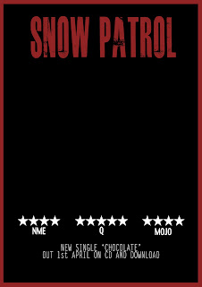
We started to create the basic layout of the advertisement and then will add the photo in later. This is the first draft of the magazine advertisement.
Although we thought that the text looked quite effective, we decided that we would need something a bit more subtle because we want the image to be the main focus of the advertisement where as this text stands out too much on the page and takes up too much space.
Also, having the text at the top of the page also risks it becoming more of a main focus than the image.
We did some research looking at possible fonts which would be appropriate to use for the text on the magazine advertisement.
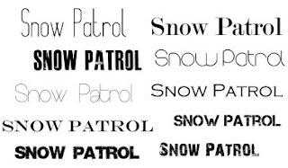
After fiddling around with a few fonts and seeing which ones looked best we decided to stick with the font 'round'. We think that this font will make the advert look quite professional and also suits the genre of the song pretty well.
Once we found a font which we thought would look effective on the advertisement, we were able to start adding text to the advertisement.
Monday, 31 January 2011
Rough Cut
Saturday, 29 January 2011
Wednesday, 26 January 2011
Rough Cut Feedback
Tuesday, 18 January 2011
Split Screen
Wednesday, 5 January 2011
Editing
Filming - London
Filming
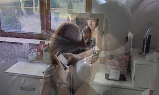
We started filming on Tuesday 28th December 2010. Although this was a lot later than we had planned, we managed to get a lot of the filming for our video done. We needed to re-film a lot of the footage as it would not be suitable to use for the video.
We filmed again on Tuesday 4th January 2011. First, Jess, Annabel, Rich and I went back to my house to film the scenes at home. This took about an hour and a half and we got all of the filming for these scenes done quite successfully.
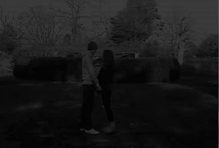
Next, we went to Danson Park to film the park scene with Rich and Annabel. This took quite a few takes, but in the end we did manage to get some good footage that we will hopefully be able to use in the music video.
We have planned to go up to London on Saturday 8th January to film the remaining scenes which will be filmed on the Millenium Bridge and Embankment.